An app that makes Public Health accessible to anyone
Overview
The objective of this project was to create an app that combines all the features that people need when using Public Health Services, thus improving the overall user experience.
Role
Product Design Ux Research
Interactions Design Prototyping & Testing
The Problem
Portuguese residents need three apps and a website to access the digital services of the National Health System (SNS). Having different platforms to access public health services can generate frustration.
Some of the most important services provided by the ‘SNS’ to the population are not accessible from any of these apps.
The login and sign up processes take a long time to complete, which can discourage the Portuguese population from using the apps and accessing Public Health.
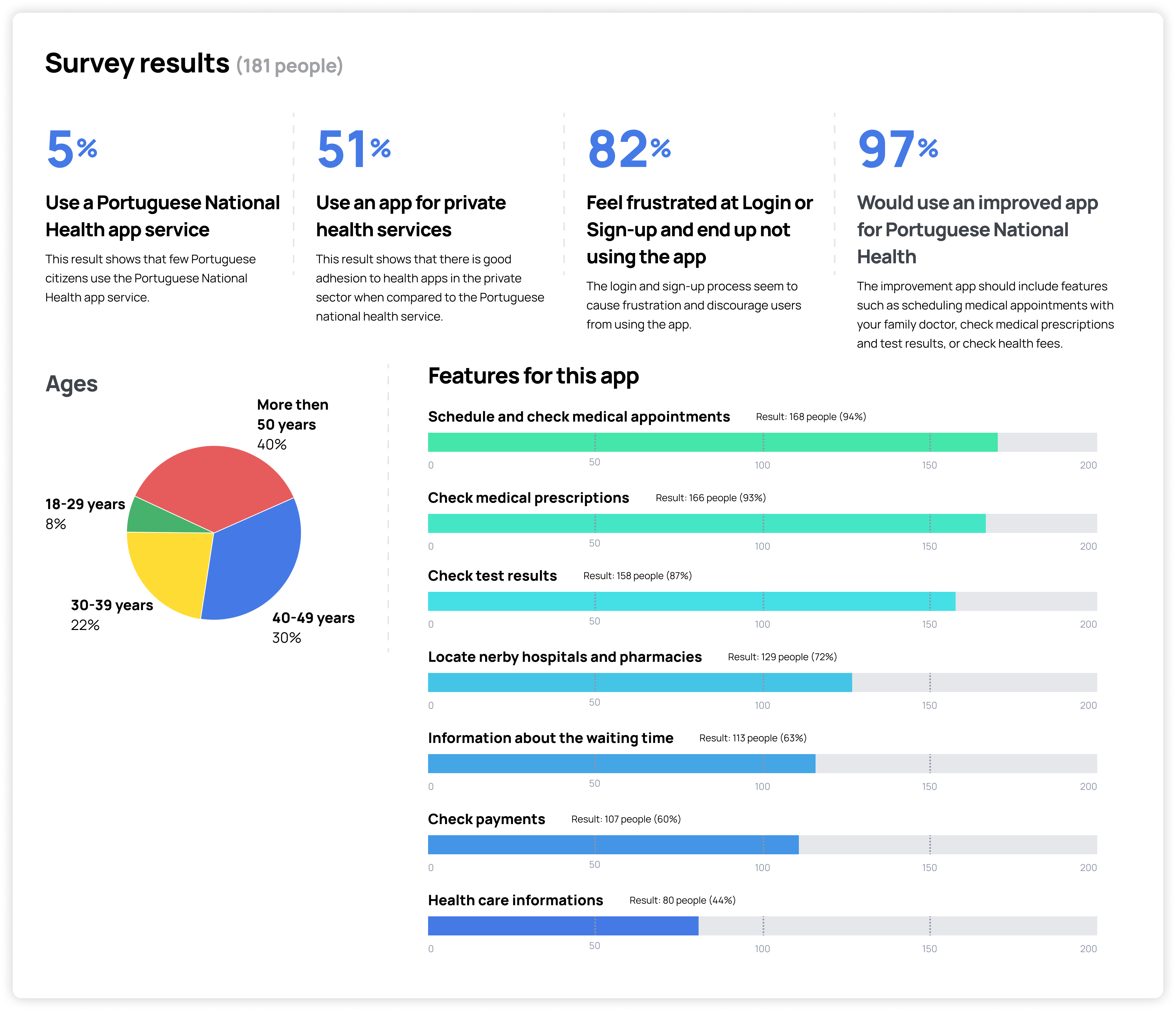
Understanding the users' problem
A survey was carried out to understand the complexity of the users’ needs, motivations, and frustrations when using the current ‘SNS’ apps.
The target consisted of people over 18 years of age, since minors are represented by their parents when they need to access public health services.
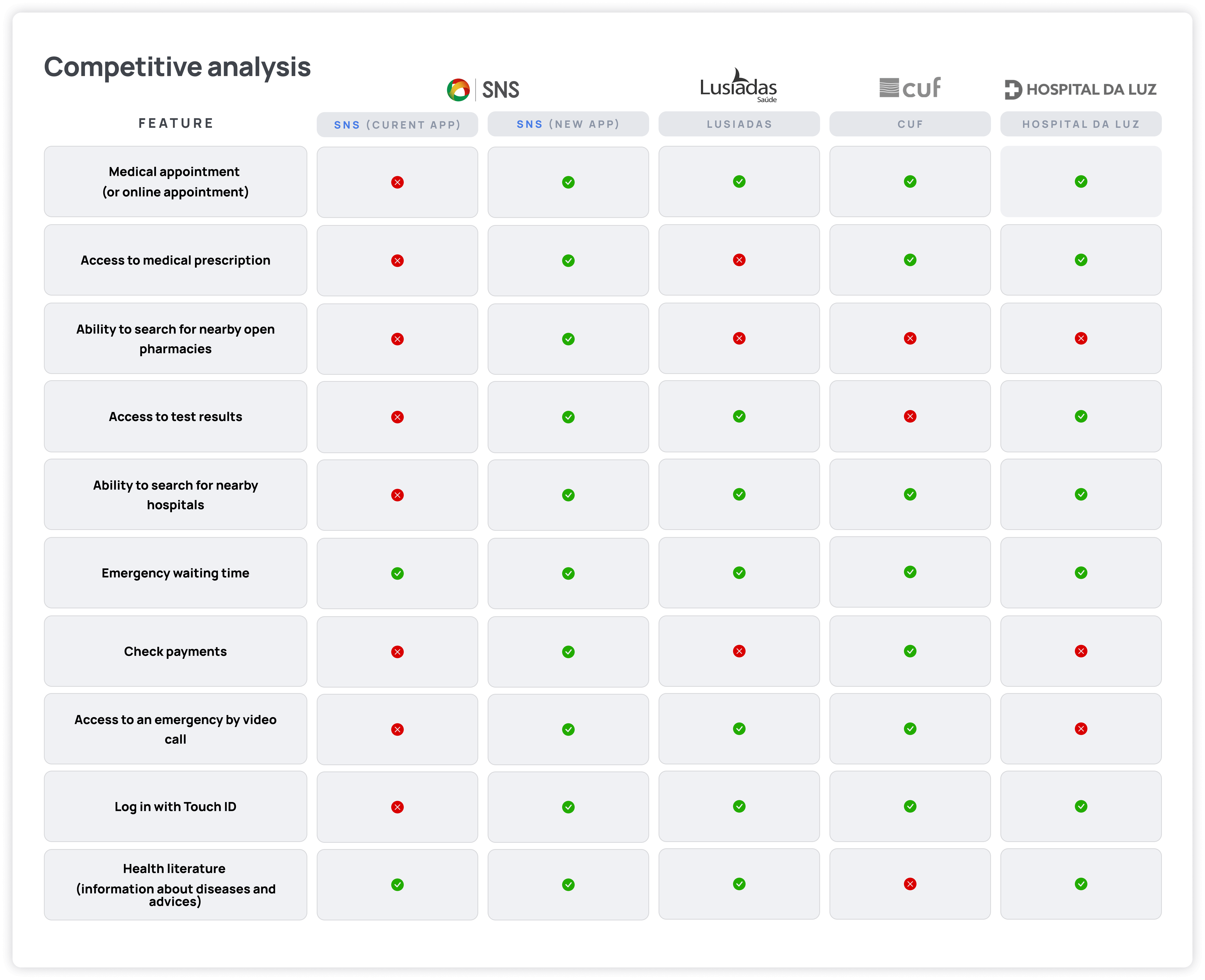
Watching competitors
After the survey, it was possible to conclude that most people use apps from the private health system. Therefore, it was decided to carry out a competitive analysis in order to gain insights into the features of ‘SNS’ competitors’ apps. It was essential to understand the details of the competitors’ services so as to provide a better user experience when using public health digital services.
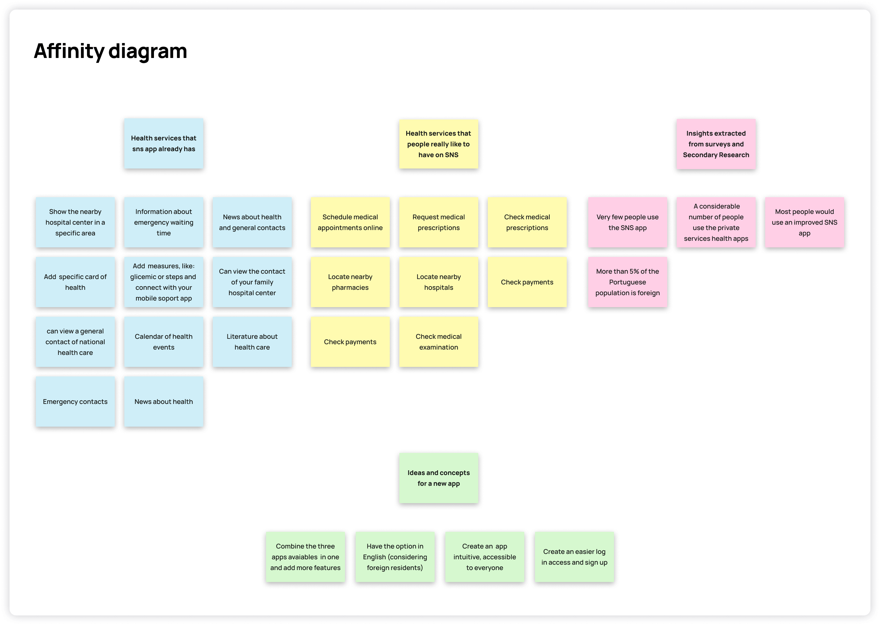
Connecting ideas
The ideas and insights, based on the data obtained from the survey and secondary research, were organized into groups. Then it became possible to define the problem, developing new insights that became potential solutions for the app.
It is important to note that processes throughout this project were not linear and that there was often a need to modify things and make upgrades in the various stages. The affinity diagram, accompanied by brainstorming, is an illustrative example of the non-linear process. It has been revised several times throughout this project.
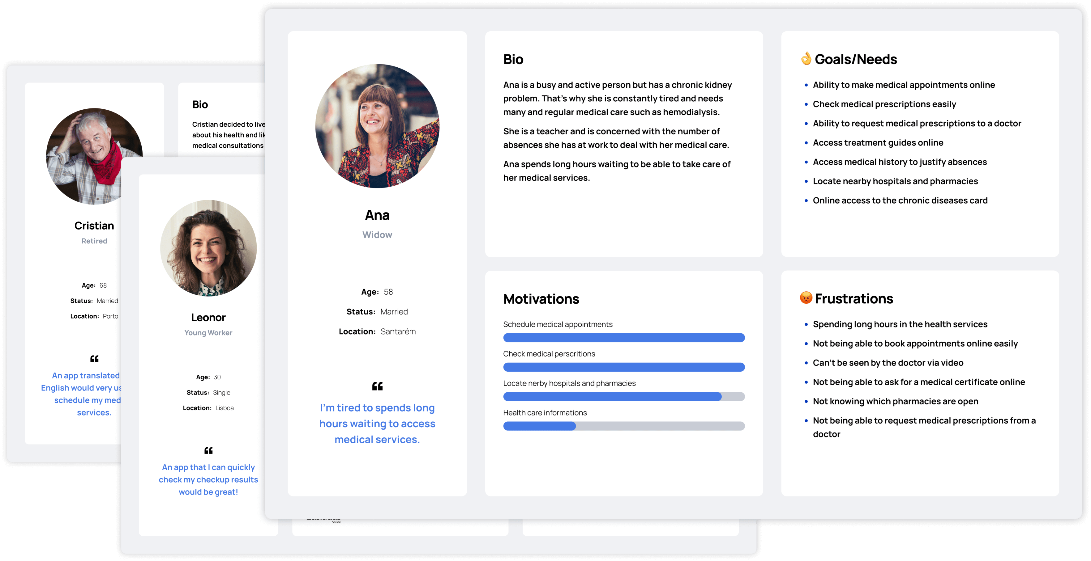
Empathize with personas
Once having concrete data and validations of our initial suppositions it was essential to create the personas so that we can gain empathy with users and so we can have a better understanding of your needs, frustrations, and motivations and behaviours.
It is important to understand why these personas feel and act in a certain way to understand in-depth which users we are drawing for.
The personas make the design process less complex and lead us to the process of ideation.
Put ourselves in the users' shoes
The user journey was built to capture the entire user experience of the National Health Service’s new app. This process uncovers the key user moments that, once improved, unlock a more compelling and more valuable overall experience, and that’s why it is essential at this stage. A visual story was built to represent how the residents in Portugal interact with ‘SNS’. It was then possible to gain deep knowledge about the users’ needs and pain points.
Redifining and simplifing the process
Based on the insights and analyses made so far, it was possible to gain a concrete idea of the problems and possible solutions for this project. When organizing the information, the goal was to make the complex system of the ‘SNS’ into something understandable, accessible, and with a rewarding user experience. Throughout this stage, the closed card sorting methodology was used to help design the intended architecture for this project.
Bringing ideas down to earth
Based on the research and the needs perceived from the survey, it was possible to develop a graphical representation of the most relevant steps for this app, and of what steps the user needs to go through. During this process, it was possible to design the tasks that the user needs to perform when using the app.
First approach to solutions
Based on previous research, it was possible to design wireframes that could provide an experience which was intuitive for the user. In the beginning, the wireframe was sketched with pen and paper so as to quickly start developing the ideas. After structuring the concept ideas, it was possible to design the mid-fidelity wireframe.
The goal when building the mid-fidelity wireframe was to test it with several users. This made it possible to gain insights into their experience while performing specific tasks.
During this process several elements were used, such as texts and icons that could represent the final prototype.
Testing the first prototype
The usability tests were recorded in video and then analyzed. These tests played a fundamental part in understanding whether the UX Research process was fulfilling the users’ needs.
Performing usability tests reduces the risk of building an app that will generate a bad user experience.
The information collected in the test was both qualitative and quantitative. Collecting concrete data helped to validate design concepts and also to get users’s reactions and feedback.
To understand how successful users completed the tasks, these were the topics explained previously: 1. The purpose of this assessment; 2. Users were asked to speak out loud about what they thought and felt while completing the tasks; 3. They were also asked to take the time they thought was necessary to complete the task, and only then move on to the next one;
In the end, users were asked some questions to clarify some doubts and gain more insight, in order to improve the experience of the app. The main focus of this quantitative evaluation was on measuring how easily the tasks were completed by the users.
Success Rate = did they complete the task?
Partial Success Rate = did they complete only part of the task?
Did users make confusions?
Time spent on the task
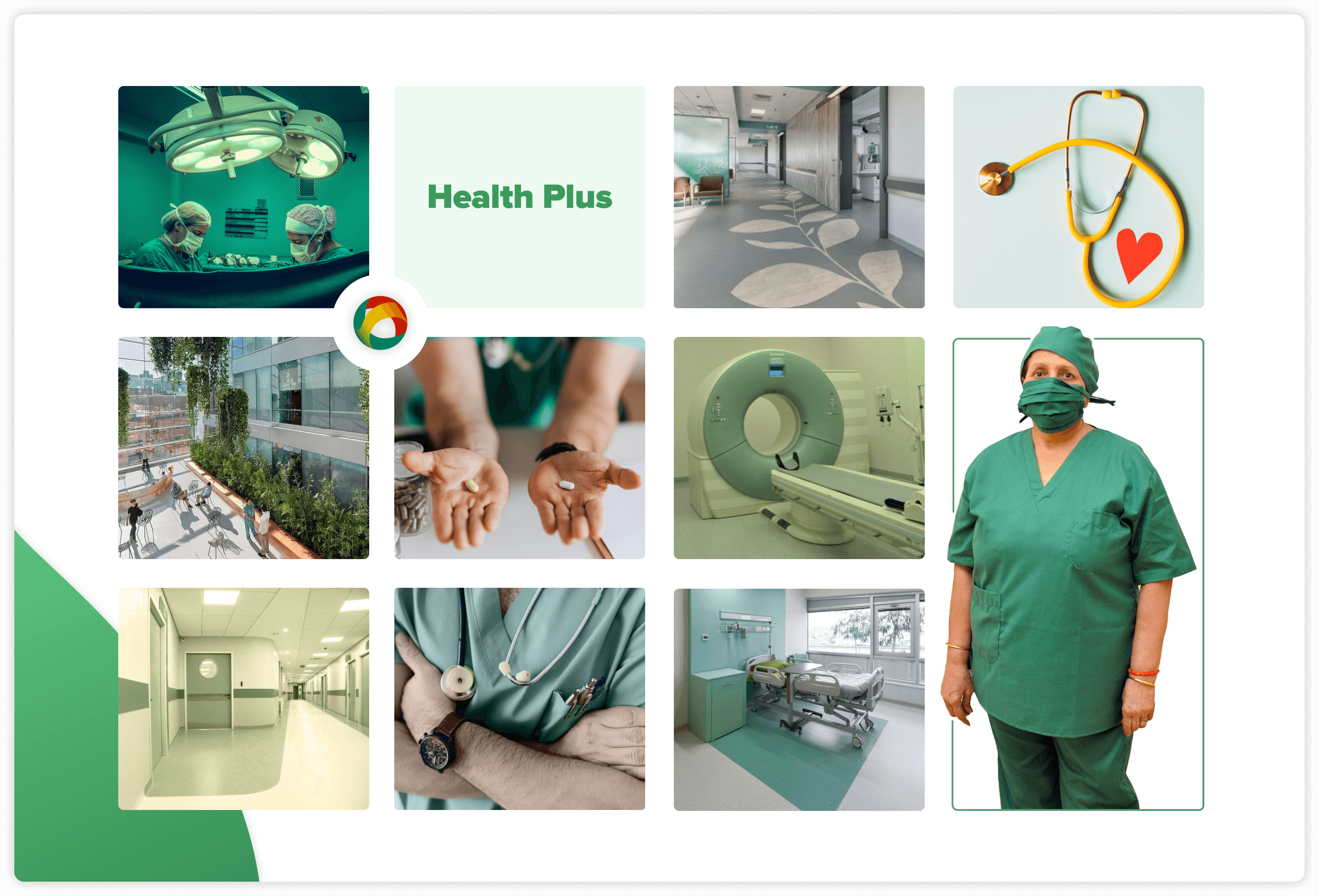
Mood board for inspiration
At this stage of the process, the foundations of the app were defined, and there were enough insights to understand how to design a good experience for the users. The mood board is a visual representation, based on inspirations and references, of the identity of the new SNS’s app. The objective is that the app will be perceived by the residents in Portugal as a professional, straightforward, supportive, trustworthy and clean digital platform.
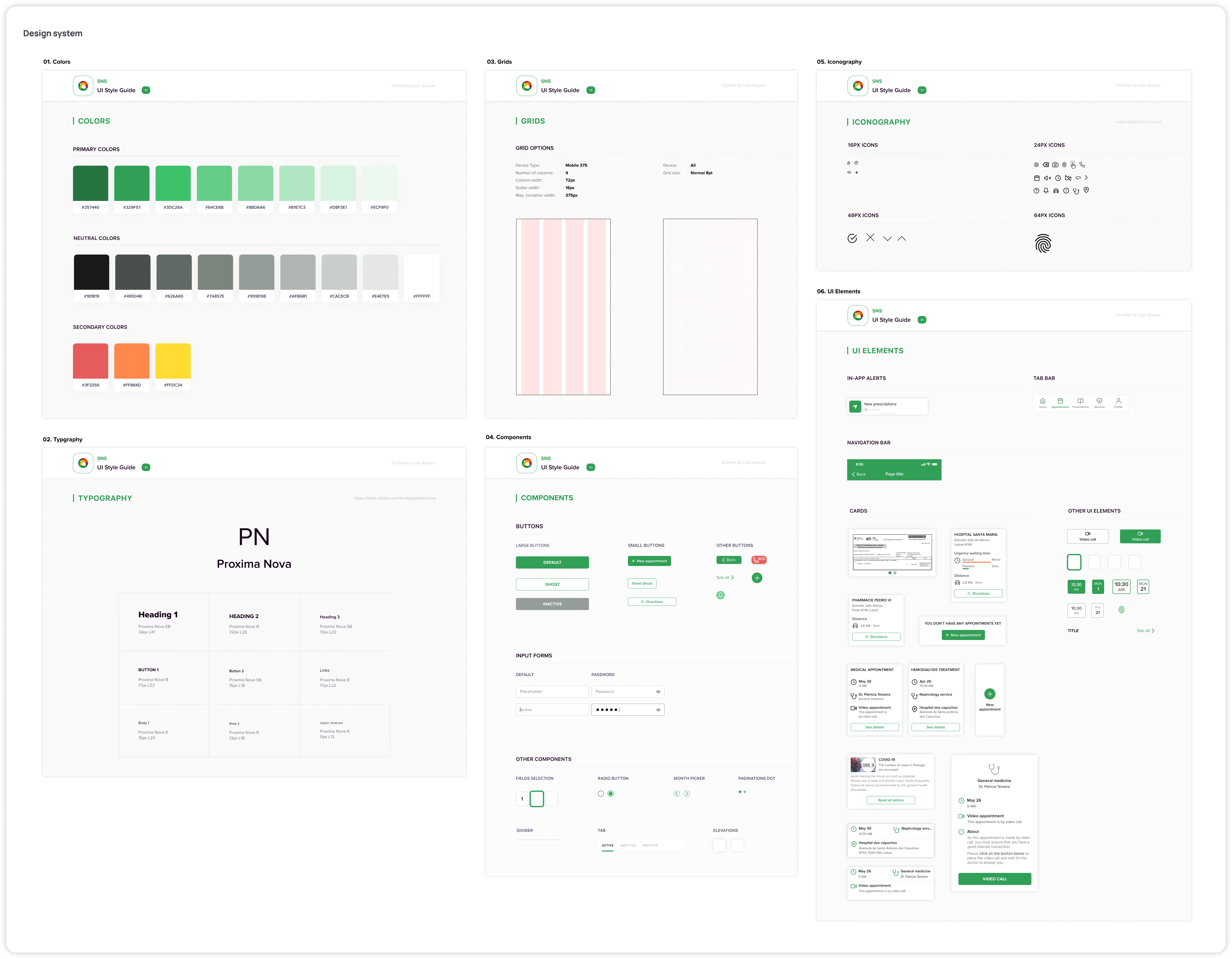
Design System for consistency and working faster
The design system is a collection of assets and components that are used to build a digital product. A design system also serves to explain why and how to use these assets and components.
It becomes easier to use and apply the components when a design system exists. It also guarantees consistency in the design process of creating an interface.
The process of creating a design system is dynamic and develops in parallel with the initial phase of the high-fidelity prototype, since it is only possible to define some components after seeing them inserted in the context of the interface.
Putting it all together in a hi-fi prototype
Once the visual part was ready alongside the insights from the usability test carried out on the mid-fidelity prototype, it was possible to design the high-fidelity prototype.
The purpose of the high-fidelity prototype is to validate the concepts obtained from the previous processes.
Testing the final prototype
To finalize the process, a usability test was carried out on the high-fidelity prototype, to ensure that the app created provides the best possible user experience.
The results obtained in this usability test were more satisfactory when compared to the first one, as:
Users performed tasks faster
Users made no mistakes
Users had fewer doubts
In addition to this, all users stated that they would use this app and that it was easy to perform the tasks.
Outcome
During the research conducted in this study, it was possible to draw the following conclusions regarding the digital platforms of the Portuguese National Health Service:
It isn’t easy to find someone who uses any of the three existing digital platforms.
Many people find it hard to access basic health services, such as making appointments through the SNS, and therefore end up using private health services.
The platforms have a very time-consuming and unintuitive login and registration process.
The main goal of creating a new app for the SNS is to meet the essential needs of Portuguese residents regarding public health. The app was built to be used by anyone, regardless of age or experience in using applications.
By ensuring a good user experience of the app, one can make a contribution to improving the quality of public health in Portugal.